The Real Wizardry Behind Creating Beautiful, Effective Websites
Websites are a completely different animal than just about any other type of creative project. And if you’ve never worked on a website project from end to end, you’re probably curious about what a web design firm actually does behind the scenes to bring your website to life. Between design choices, interesting effects, user journeys, fun interactions and complicated functionality, clients often shrug their shoulders and encourage us to “do our wizardry” to make their site great.
And so it can seem to anyone outside of the fields of web design, content and development. But while it’s fun to imagine strange and fantastic things happening out of sight, the truth is in some ways even more fascinating: good websites are the result of sound brand strategy, inspired creative, behavioral psychology and good old fashioned experimentation.
The 3 Components of the Website Creative Process
While we hate to take the mystery out of things (who doesn’t want to think of themselves as a wizard!), the creative process is really about three key components coming together to produce the desired results:
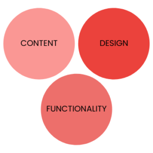
- Content – to tell the story
- Design – to guide the story
- Functionality – to make the story work
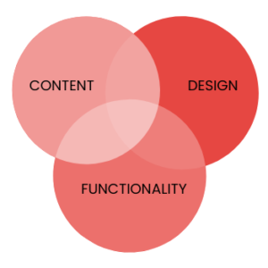
And while each of these components have processes of their own, good web agencies know that the key to a great website is marrying the three from the start of the project to well after launch.
So it’s less like this:
And more like this:
Research has shown repeatedly that you only have a few seconds to grab a user’s attention when they land on your site. Websites with cohesive content, design and functionality are more likely to both snag and, more importantly, keep a user’s attention and encourage them to keep exploring.
Content – Telling a Story Moment By Moment
Website content is about more than just conveying information about your products or services. After all, your competitors are doing the same thing, so you have to find a way to stand out. Experienced website content writers take all that information and find a way to connect it strongly with your website visitors, encouraging them to learn more, read more and ultimately take an action.
- For content writers, the process starts by mapping out the answers to a few vital questions:
- Who are the key users?
- What information do they need to take an action or make a buying decision
- How should the website flow to help users get there in as few clicks as possible?
Content writers will often begin by conducting a content audit of your existing website, evaluating it page by page to find gaps in information or areas of opportunity. From there, they may provide a detailed outline for the new site, providing key messages, suggested content, target audiences and call(s) to action, all on a page-by-page basis.
As an additional challenge, website users tend to skim web content to quickly find the information they are looking for. So when it comes down to actually writing the content, the copywriter must find a balance between creative, attention-grabbing copy and clear-cut, detailed information.
Even the smallest piece of copy requires thought and attention, from naming your pages in the navigation menu to writing disclaimers. For example, think about a basic contact form. The button could just say “submit”. Or, the button could say “Get in Touch.” Both are just fine. But which feels more on-brand? Which seems more like to invite a user to complete the form? These are things the writer must consider.
Of course, all of this content must still reflect your unique brand identity, adopting the particular tone and voice of your brand to create consistency across all brand experiences.
Design – Creating a Seamless User Experience
Good website design is about more than being pretty; the quality of your design actually influences user impressions in a way that can greatly affect your bottom line—positively or negatively. Consider these stats:
- 38% of people will stop engaging with a website if the content/layout is unattractive (source: Adobe)
- 48% of people cited a website’s design as the number one factor in deciding the credibility of a business (source: BJ Fogg, Stanford University)
As you can tell, web designers shoulder a heavy load of responsibility for producing beautiful, inviting websites that make people want to stay and explore.
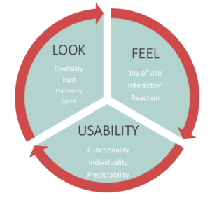
For websites in particular, design is very much a blend of data-proven user experience elements and pure creativity and artistic sensibility. It comes down to three factors:
Designers must balance your brand standards against color psychology, imagery versus styling, art versus effectiveness. Every element large and small is evaluating carefully to ensure the site is intuitive for users. For example:
- Button styling and placement — Buttons are a visual cue to users to take an action. The size, color and location of buttons all matter when it comes to motivating a click.
- Font styling and content flow — As we mentioned in the content section, users tend to skim web pages. So font choices, headline and subhead styling, paragraph orientation all must be carefully designed to work for both skimmers and those who want to dive in.
In this process, the designer will also have ideas for interactive elements, suggestions for how page scrolling can operate (parallax versus elements that fade in from the side, etc.) or other ways to engage the user.
Functionality – Building, Optimizing & Working Like a Charm
Are you surprised that we think of website development as part of the creative process? You wouldn’t be alone. What seems like a very straightforward technical build is actually of opportunities for creativity.
While there are a lot of established processes and code banks for developing elements of a website, there’s also a surprising amount of variety in the way an element can be designed to function behind the scenes. Additionally, you may want a specific type of feature on your site that isn’t readily available as an off-the-shelf solution. In that case, web developers gleefully begin solving this puzzle by creating a custom path to your Holy Grail of functionality. It’s an adventure in problem-solving, creative code application, and trial-and-error to produce the desired action.
Beyond complicated functionality, developers must also find ways to keep your website operating at its peak, fully optimized for the way users experience the internet on desktop computers, tablets and smartphones. Why is this so important?
- 53% of mobile website visitors will leave if a webpage doesn’t load within three seconds (source: Google)
- Sites that loaded within 5 seconds boast 70% longer average sessions and a 35% lower bounce rate (source: Google)
Post launch, developers continue to monitor opportunities for optimization, as enterprising coders are always releasing new, more efficient ways to deliver functionality.
The Wizards Behind the Curtain
Some web agencies like to think of their creative process as a secret sauce to be guarded jealously, preferring to preserve the mystique. Ehhh, I personally don’t think that’s necessary, and neither does the Skyhook team. While the exact way web agencies do certain things may be proprietary, for the most part, they should be more than happy to explain the processes along the way. That’s because good web shops (like Skyhook) know the real secret behind a successful website process: you. That’s right—you’re just as much a wizard as we are. And together, we can create magic that attracts customers and creates raving fans for your brand.


